About This File
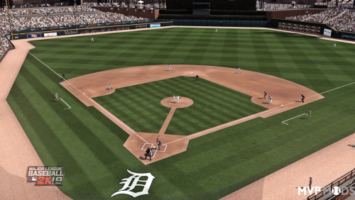
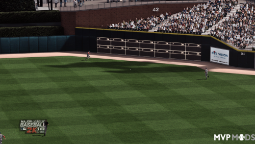
Suggestions for which ones to go for to get an overall idea
- Atmosphere blue added color
- sunshade both versions - similar but cleaner light, yellow/beach sand
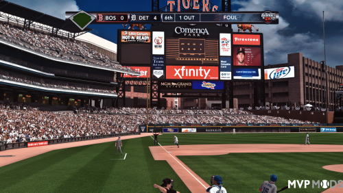
-original V1 (first screenshot with warm colors)
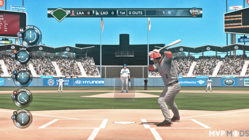
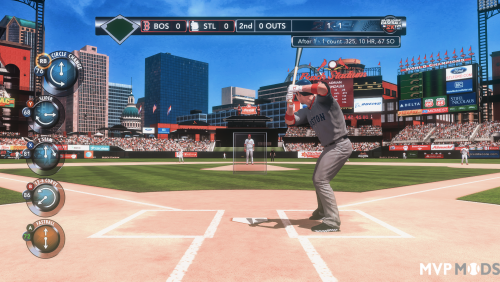
- reshade sunnier V7 -the last couple of screenshots, its for day and night also, this one is crystal clear light and came up really well but use any of them
- night version of sunnier V7 is may be only useful for night, but all files basically go alright with night time, though I usually only play in the day or afternoon, changing manually, but some stadia look great at night some don't normally, hope this helps with that.
Some of these I tried and succeeded largely in getting a real 'sunshine' kind of look, even when its a subtle effect. In one or two I selected very particularly a specific color temperature shade of RGB that when applied via a tint blends the scene as the 'light' dynamically happens in with the luminance settings and white balance, thus creating a layered affect upon the end result. Well that RGB tint is very specifically applied and if you are going to alter anything - lol man, I can't stop you - but don't alter that whatever you do. This is essentially a 'light bounce' kind of effect and will make more sense when in motion. But its not ray tracing or nothing, its not as dynamic as one may think nor is it 'reflective' as such, it just takes calculations from the scene, and reshade facilitates that.
I have tried to make it all consistent and even, and the brightness which for your screen may be too peaky, you can tone down instructions later, but it should be good to go, and many shades on either side of white, warm/cold, etc in sunshine and not.
I tried to keep the consistency between each one because the color grading used across them is particularly cinematic/neutral and pleasing. Its blending nicely with the luminance, and the colours as you can tell come across fairly realistically.
Why reshade? So when they did the game to go easy on the eyes and have all colors pop and do varied times of day and weather, they did it all around green. But the game has a green tint to it, makes sense in many ways, but now we can reshade it. I think you are going to like at least several of these. They are all built off the same base, and yes I guess you can even use them in other games or get an insight into how the luminance and gamma and balance all goes together.
If you stare at something bright and color-starved for too long it can sear your eyeballs since you have to focus harder. A little fix for that near end if its a bother. But make sure to get eye-rest haha.
I am not using HDR for each and every one or anything like that as its simply unnecessary for some of them. The colours are gamma-corrected and all that, and the main file is balanced around red, but one is balanced around blue, one is simply 1.0 1.0 1.0 so its very neutral.
If you add things to these you're just kidding yourself, but lol as if I'd know, so you can change them but dont forget to make a backup.
The original graphics the game has are good and they are clear and vibrant, they are uniform and have a yellow-green-grass tinge, it favors no single colour but indeed, its a bit of a mish-mash. Baseball stadiums are unique and varied so I totally understand the colour the way they did it, it was super cool.
This could become your most favored reshade. The result is very different and its been good to see the stadia with the new scenic lighting and effects. Its not perfect but its a real improvement. Its very enjoyable. There's 2 ends of effects - red/shadowy to blue-brighter or clearer and yellow sunshine style, all done without trying to blow out the image. You can easily adjust any of this.
For reshade I add keys to control the files
I set shift f1 to turn it on and off and F1 to go forward though the files in-game and F2 to go backwards. Works like a charm.
Troubleshooting and install further down in case you do not know
I have played baseball games for years, and in life, and all that and like most people have a sense of how it feels to sit in a dark spot looking out on the sunshine or anything like that, I always wondered why the game light was so flat, it was just how games were back hen, so I have always had an interest in making something with a grassy field come to life when it came to this title. I am also from Australia and even the kangaroos can struggle with the heat at times. So if I have made the dirt too red or something I am sorry for that, as some stadia I have on this (from this website) use the alternate dirt, eg picklebrad and they get darker over time. You can probably adjust that out with reducing colour maybe, but I think it should be fine as the color grading is pretty good.
Today we can use the greater processing power, so I have made these files, and the colour grading as you will come to see is very different, may be you will find it preferable. I liked it so much I only play with it now.
I originally made it to work with the hd skies cloudy day games. And I felt the result was excellent. And it works on any and every weather/time of day.
After several attempts I was able to do a HDR version and then a clear blue version.
I also made a version that is the follow-on to the original v1 red-warm version, and if you switch to it, you will see how it makes things seem sunnier - in a cloudy day its a little, on a sunny day its a lot, so may be I should adjust its contrast a little downward but if you switch between them you will see how it seems like the sun is breathing which is an effect ENB actually does in Skyrim SE...
No, so this game doesn't do clouds like that but you can switch it up manually depending on what match you are playing. I know the light changes from inning to inning, so the colour and light gradually changes, so it is up to you whichever version you prefer, but one of v1, 2, 3 should suffice.
The other versions are simply alternatives, one that is slightly less red, one that is 'sunny' with HDR.
With them all, you can open up after making a backup, the filter and change down contrast in filmic pass. Filmicpass is actually one of the main filters, another main one kinda is DPX and then HDR if used. Those values if you believe this is all too bright or not colorful enough, then you can change it.
Info on installing, very easy:
This is the realshade file I use, using it with realshade 5.4.2 available at https://reshade.me/ hit the download link. Reashade is easy to install you just run it and point it in the direction of the file you use to start the game, select every filter available in the install, and it will download all the filters. You then run the game and use home key to bring up the menu, run the tutorial and select a key later on in the settings to make a toggle. Home will always bring up the menu, but to toggle off/on I personally use shift-F1. However at some point make sure to drop this file into the folder. You will then select it from the menu (home key by default)
Description:
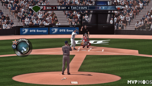
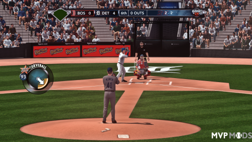
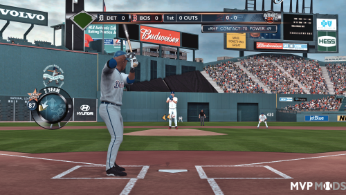
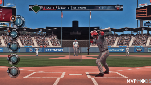
In the pictures the last two are comparison shots you should be able to identify the original which is the very last picture. It is not unusual for a game especially of that era to use green/yellow shades or similar when it comes to making something that resembles sunlight or as the basis for their color in game. Movies will do it too, however, you will note how the realistic reshade is using more blue as a base. The contrast and light and shadow is also improved due to other filters.
I am also using the HD skies in miscellaneous section of this website.
Troubleshooting
Each picture is a progression from v1 to v3, with the last ones adding in the contrast changes (original v1 did not require contrast changes), but Gamma and constrast on your monitor may alter it a little bit, but also if it looks 'pasty/grey or pale' you can adjust the contrast so you get that nice deep black - that is the 'greyscale', and its white balance is out if it does that. If however its just far too bright for you, you can relax your eyes by either 1 turning off sharpening, or turning it down, 2 changing contrast lower slightly in one of the filters for example in 'filmicpass'.
One example of that pasty-grey look or grey-film cast over a screen is easily fixed. Your gamma may be at 1, and if you made it 1.1 it would make the screen more black and thus remove the pasty-grey casting on the screen. If however your screen is too bright, then you would lower contrast. Other signs may be can't see shadows on a grey uniform - then you would lower or increase contrast until you can see them. If its simply the whole screen is too bright, you can turn down those settings as well, or turn off HDR or use a non-HDR one. Turn any and all off/on if you like, just keep a backup copy.
Another example may be you see it as being too dark, squashing colours, or too shadowy as in you can't see details - in this case your gamma would be too high. If gamma is 1 then you can take it down to .9. Values at this point are just arbitrary...but on phones and tvs they may aim for 1.2 or 1.1 gamma. In print media it may be 1.3 since you are looking at things on a page, for computers, 1.1 is a relatively high value. So lowering it will balance out the 'greyscale'.
If you like it less colour (because sometimes too little colour will change colours as much as too much colour) you can adjust the settings in colourfulness. However as they are they are pretty spot-on. It might be your monitors color is too rich. But if you do not want to adjust that you will be able to find a setting. A tip: don't try to adjust individual colours - if blue for example is too bright, just lower all colours a fraction, while your eye may not see them all as being too bright, they probably are. However, I think you will find no problems with colors. The way the filters work is it goes off of a base sheet/lut for brightness, it should work independent of literally everything - however it might be you have set the nvidia/amd driver color at a different value. You can also change things there. Its ultimately adjusting the same thing as reshade.
- if however it is too bright and you know something is 'blown-out' in terms of white-washing over the colours like in the menu system, or for anything else it could well be the contrast setting (like above) but here is a setting in filmicpass called contrast and its set to something like .850 or even .900.... you can lower it by 50 points each time you like to see if the screen comes back closer to what you like.
I'm sure you will be fine. Good luck!
Edited by Truncatedjive
redid description added troubleshooting
What's New in Version 17 slight tweaks - overall scene See changelog
Released
- if you prefer slightly more vibrant colors then this is for you - added naming convention to Atmosphere (blue) A1, A2, where A2 is a new file with the colorful setting boosted to 0.33.
- Atmosphere (blue) A1 remains at the more consistent and less vibrant (daylight-type exposure-washed) 0.11 setting.
- made new naming convention to hopefully keep the related files next to each other in the scroll list of reshade.
- 'Atmoshpere' files are typically more dark of scene. 'Blue' refers to the white balance.
- the files are not meant to perfectly color correct in terms of being ideal for a game, take yellow as an example it is now less bright in many - but this is more by design, in fact yellow was too bright in game tbh though it looked really good. This is one of the detractions of color-changing, yes it technically looks better to have all colours including yellow being on an even keel and even red being slightly washed out (its more accurate as such) but that is different to green with how the game arrived, and if one didn't have reshade they did the right thing to make it crystal clear and the green haze.
- so in light of that and how yellow is less yellow like it was (it was over-yellow bright) same with red, if you like the pop more you can dial up the colour. But its probably not a good idea - but if its hurting your eyes don't forget you can turn off sharpening or turn down sharpening to make the picture softer



![More information about "MLB 2k25 [Soundtrack]"](https://www.mvpmods.com/uploads/downloads/monthly_2025_04/MLB2k25Soundtrack.jpg.bf6166f37848e0d98a6aca7b5acee939.jpg)