About This File
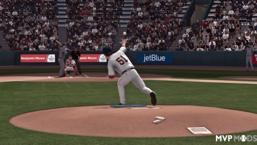
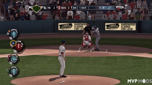
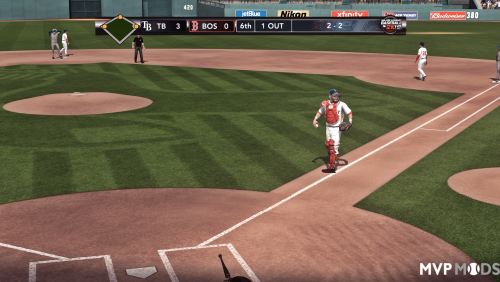
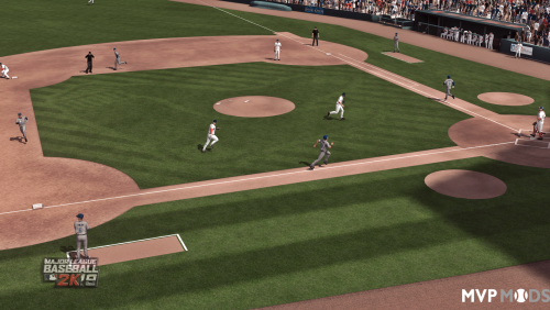
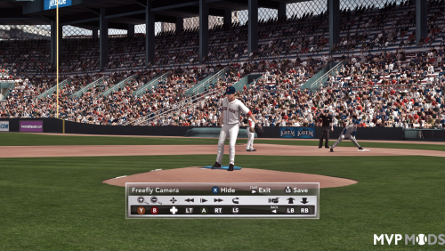
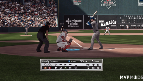
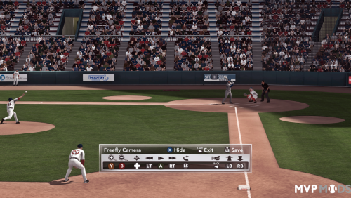
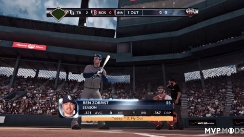
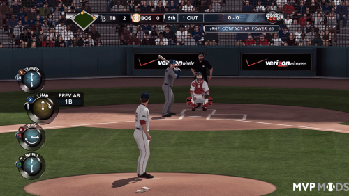
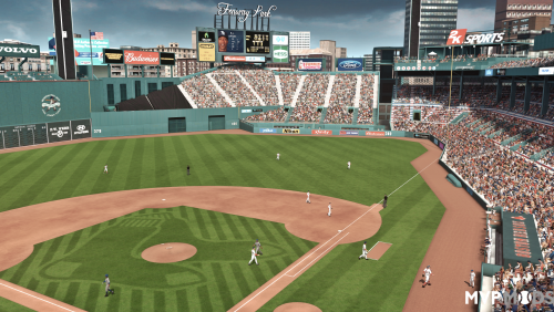
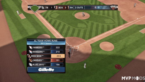
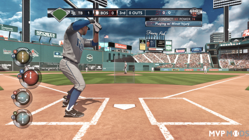
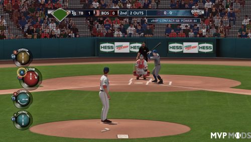
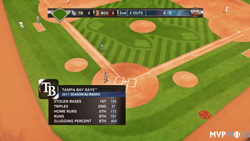
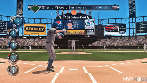
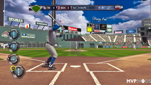
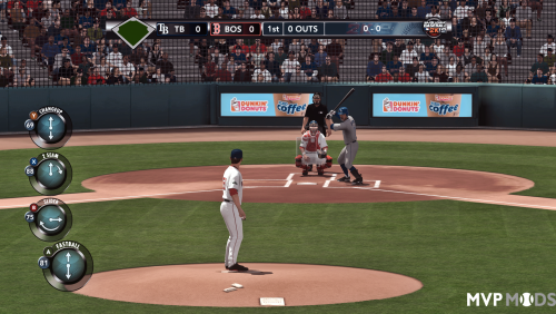
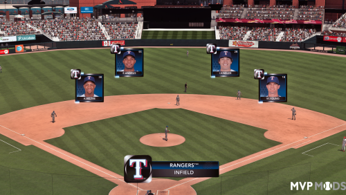
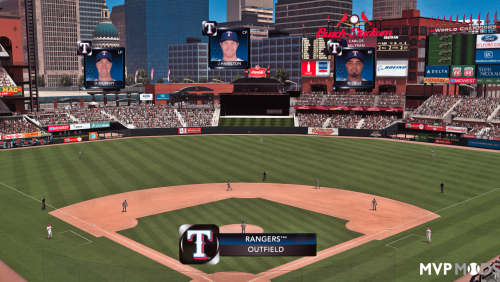
Now at version 56. But that will be it for a while now. This is real good. In line with the original look as much as is able. The majority of screenshots are from two of the files, V1 Better Realistic Reshade and V6 (a, b, c) 'Better Realistic Reshade Balanced' file, for reference (the first ones probably pre-tweak of similar file but with some color), this is the 'actual' original reshade with what probably is now (I have forgotten) the most consistent, accurate color which can match the games style if it needs to - and I have put in 3 versions, 2 with exactly the same color strength ( but entirely different results), and the 3rd too with 'less' or more 'real' color strength (combined with the color grading and luminance; some others I used a subtle tint but not this one), but the 3rd's balance is lifted from 1.0 (fully balanced i.e 1.0, 1.0, 1.0) to (1.2, 1.0, 1.0), thats 3 different versions of one of the most excellent versions, so you will find which one you like best for sure. I have also done this to other styles. Balanced 'C version' may seem washed out well most others and in general most games, have boosted color as it is - since more photons and green light etc means brighter and easier to view colors and no eye strain for said colours. So its not that developers obviously are trying not to do that, I still use the original sometimes. Ah well. Here's a reshade anyway.
Plenty of options, colour strengths, and styles, even one that just changed the colour grading of the original scene. The truth is yellow was boosted in the original mix of the game but it was all done by the developers very consistently and really cool, all that kinda stuff is done in a most pleasing way its just the green tint for eye-health or something was making me wonder if other color gradings may fit. So when you notice red and yellow a bit fainter its more approximate to the consistency of color and gamma, as the color grading of this is different to the original game's I may not have boosted it. Which brings me to the point: if you think its too colourful or not colorful enough then you can boost it up or down in colorfulness.
To get that crisp sunny-day look like in the other files I added, you can experiment with tone mapping and colorlab - one idea for example I just did it and added it, was for balance - you will notice the color balancing is sorta good but not great always, well, go into that shader and make the first 1.0 into a 1.2, it will lift the whole colorspace up. So always if something is dark that is the spot to first see, other times it might be in the gamma but I have adjusted a lot of them, I might tweak a few more at some point today.
I have made sure to finish up the scenes and soften them, and all that, sometimes reshades or ENB's can blow out thing or make too many highlights or sear your eyeballs, if anything is too bright just adjust gamma and contrast. Even turn things off.
But I carefully selected and applied a couple of very specific RGB tints to better make sure the proper daylight was represented - whatever you do, yeah don't change those. You will literally tear the whole thing down, there's color grading and lighting, and then there are specific hues that can 'bring out' the scene.
I also added in at some point Blooming HDR and tuned it for as many stadia as I could reasonably expect. So there's some HDR in there but its also very subtle.
You can find reshade here https://reshade.me/
I did not bother with putting on Ambient Occlusion in the final release as the game literally doesn't really benefit all that much from it, due to reshades implementation being a little obtuse and the game not being made with it in mind. However the option for that is there, and at one point I was using it. Setting up the depth buffer for things like that is an easy process.
NOTE: if you liked the other ones I put up the other day hopefully you can still use those, but these are those combined and added to, touched up and smoothed out. However, even myself, I still take the Sunny? version of the original files as I think its really cool...I had to turn the brightness down when blending but that one is pretty cool from the old files.
Edited by Truncatedjive
additional info
What's New in Version Mainline V53 Sun breathing See changelog
Released
- added into this version 53, some more softening in places, color corrections for some of the less done scenes
- added V6a as an alternative style that is somewhat brighter (though not glaring) and might appeal to people. 6a is essentially what it looks like when the sun slightly comes out from behind the clouds. versus V6




![More information about "MLB 2k25 [Soundtrack]"](https://www.mvpmods.com/uploads/downloads/monthly_2025_04/MLB2k25Soundtrack.jpg.bf6166f37848e0d98a6aca7b5acee939.jpg)