Jump to content

2016 Padres 1.0.0

   (1 review)

5 Screenshots

About This File

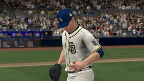
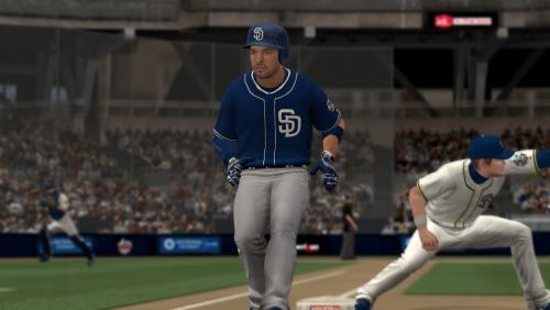
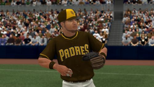
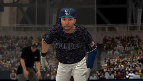
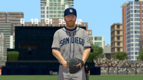
My best rendition of the 2016 San Diego Padres uniforms. Thanks to raidersbball20 and kccitystar because I'm sure I used their assets (like pants - I have no idea how to change belt color, lol) at various points along the way. Color rgb is picked from the official style guide while the alt camo I kinda just eyballed. NOTE: Alt grey away uni will overwrite #474 slot of your roster uniform list.

User Feedback

Recommended Comments


Good job !  Quick question, aren't the yellow and white SD cap logo's on some of the jerseys as well?

Thanks. Not according to the style guide, but I could work off an example if you have one... Here's the only example I could find.

Link to comment
Share on other sites


Thanks. Not according to the style guide, but I could work off an example if you have one... Here's the only example I could find.

Nice job!..  btw.. How do you get access to the style guide?. 

Link to comment
Share on other sites


Thanks. Not according to the style guide, but I could work off an example if you have one... Here's the only example I could find.

No biggie, if they aren't on all the jersey's and hats, it's no problem.

Link to comment
Share on other sites


Good job !  Quick question, aren't the yellow and white SD cap logo's on some of the jerseys as well?


Nice job!..  btw.. How do you get access to the style guide?. 

Haha, desperation, dumb luck and google: "site:(MLB team domain here) style guide". So in this case the google search query was "site:http://sandiego.padres.mlb.com/ style guide", and lo there it was at the bottom of the page. I wonder if this is some sort of oversight or has something to do with a media buy/tie-in with the all-star game. Hmmm...

Whoops... I accidentally quoted LouisvilleLipp; I have no idea how to properly use this site... Anyway, yeah, I like the SD blue and gold way more than just blue and that beige business from a couple of years ago. Their color sceme is a mess from a design and usability standpoint. I'm pretty sure they're using a couple different hues of blue plus white, yellow, brown, grey... No consistency.      

Edited by TheWizirdsBaker
Link to comment
Share on other sites


Haha, desperation, dumb luck and google: "site:(MLB team domain here) style guide". So in this case the google search query was "site:http://sandiego.padres.mlb.com/ style guide", and lo there it was at the bottom of the page. I wonder if this is some sort of oversight or has something to do with a media buy/tie-in with the all-star game. Hmmm...

Whoops... I accidentally quoted LouisvilleLipp; I have no idea how to properly use this site... Anyway, yeah, I like the SD blue and gold way more than just blue and that beige business from a couple of years ago. Their color sceme is a mess from a design and usability standpoint. I'm pretty sure they're using a couple different hues of blue plus white, yellow, brown, grey... No consistency.      

Lol! ThanksI,  might try the same and see if I can have some luck. I'm using ty's roster to change team colors and want to find the most accurate color codes.

Link to comment
Share on other sites

Just wanna say that these are very nice! I've been waiting for a couple months now for someone to post one. I really appreciate this!

If I had to nitpick some things to offer constructive criticism, I think the blue looks a little too blue. They definitely do look like that on the style guide, but for some reason it doesn't look right to me. I thought it was just the pictures but I saw them in my game and thought the same thing. Looks like it's every blue in their uniforms that look off.

I quickly Googled "Padres 2016" and found a couple photos that kind of show the blue.

040116-MLB-Padres-Wil-Myers.vadapt.664.h                                             2459042__sd_sp_padres_0405_KC__046e_tx60

It looks a lot more darker than the ones in the game IMO.

Something else I noticed is that the logo on the hats seem a bit small. I'm not sure if that's something that can be changed at all. It's not a huge deal (no pun intended), but definitely something you could change if you're open to tweaking it.

Other than those things, I really love these! The digital camos looks super sharp, and the new home jerseys look good!

I'm definitely going to try my hand at tweaking the colors a bit though since its my preference that they're slightly off anyway.

Thanks again! Keep it up!

Edited by sdboltsy
Link to comment
Share on other sites

Join the conversation

You can post now and register later. If you have an account, sign in now to post with your account.
Note: Your post will require moderator approval before it will be visible.

Guest
Add a comment...

×   Pasted as rich text.   Restore formatting

  Only 75 emoji are allowed.

×   Your link has been automatically embedded.   Display as a link instead

×   Your previous content has been restored.   Clear editor

×   You cannot paste images directly. Upload or insert images from URL.

×
×
  • Create New...