


eskie01
-
Posts
77 -
Joined
-
Last visited
Content Type
Profiles
Forums
Downloads
File Reviews posted by eskie01
-
-
Not bad but the red needs to be a redder shade. I really like the shoes and the backup photo of one of the players wearing them which is proof that they are appropriate.
Very nice,
Eskie01
-
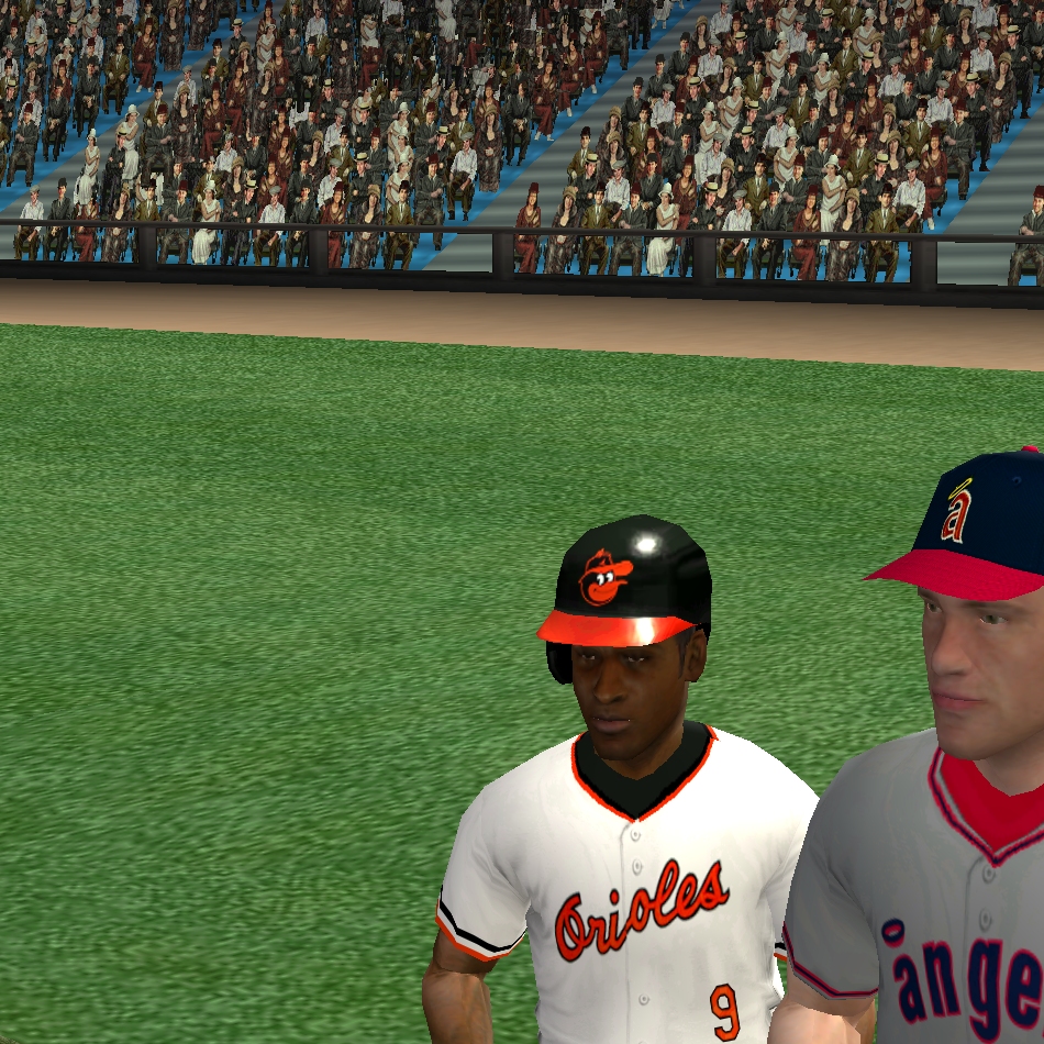
These Orioles uniforms are just wonderful too like those A's that I looked at. I especially just love those caps and helmets that he did for this one. They look just like the real ones that are shown here. I don't know why there weren't included in the newer version because they look a lot better and more like the ones that the players wore in 1970 and 1971.
Eskie01
-
These just look wonderful! He even has the proof of the original there to compare. Just GREAT!
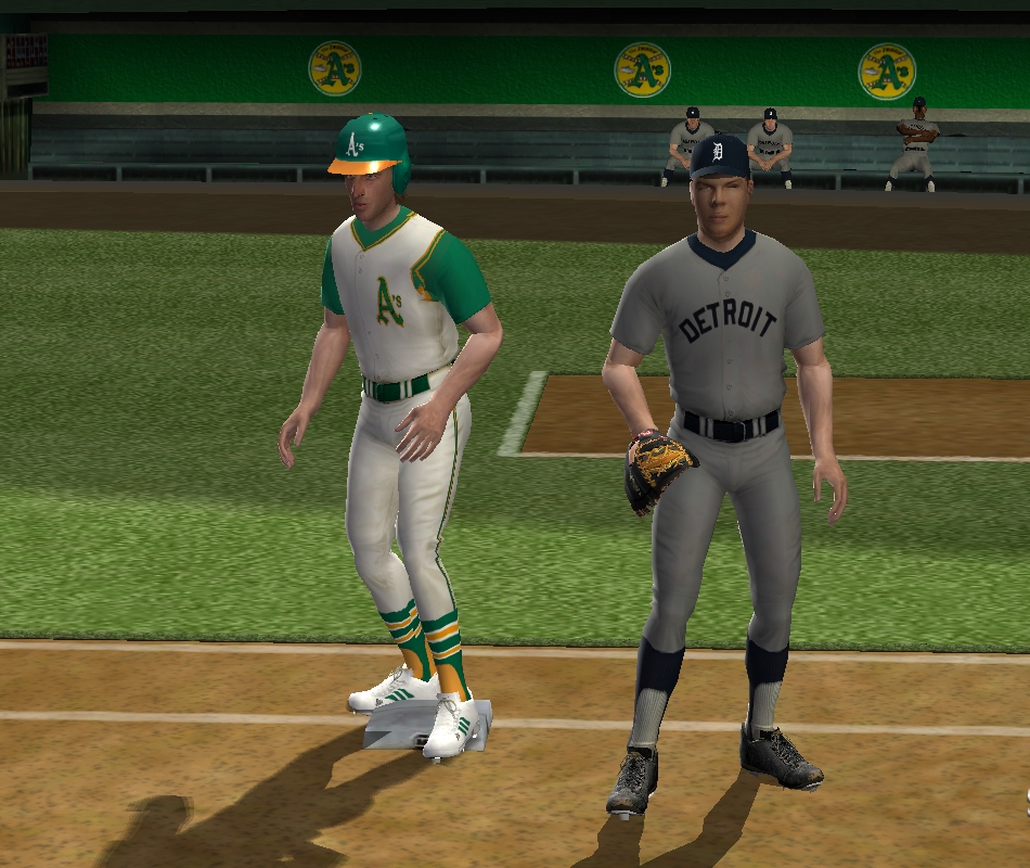
1971 Oakland A's Road gray uniform set
in Uniforms
Posted
Very nice set and most of the items are VERY accurate. The numbers are exactly like the orange as far as the type and color shading. The wristband shouldn't have any team emblem on. The sleeve shade should be maybe a little darker but not much. I like the jersey logo...it looks like the original even with the shineyness too. The manager's jacket emblem needs to be a little better like the jersey one itself but overall pretty nice though.
Eskie01